A theme is one of the most important things about a website. It is the first thing people see and influences people’s perception of the site’s content in a big way. Today I want to share a review of my personal favorite WordPress theme–Apostrophe 2. Apostrophe 2 is a theme by the all-pro developers over at wordpress.com. However, the theme is also available to download for free for use on wordpress.org websites (link). Apostrophe 2 is “a refreshed version of Apostrophe, with more features and added flexibility.” It is a simple, clean, modern, professional-looking theme ideal for blogs and other “magazine-style” websites. As of the date of this post, it works brilliantly on the latest WordPress update.
I’ve looked at hundreds of themes over the years and there are a few things that stand out to me about Apostrophe 2. I believe the desktop view (see cover photo above) has a nice aesthetic and effectively markets a lot of content to users. However, the layout of Apostrophe 2 is also optimized for mobile browsers. Internet usage has been transitioning toward mobile (phones/tablets) for some time. Mobile has now surpassed desktop computers as the most common way people browse the internet (link), and we can only expect this trend to continue. In a word, mobile is going to be the most important layout for a good majority of websites in the future.
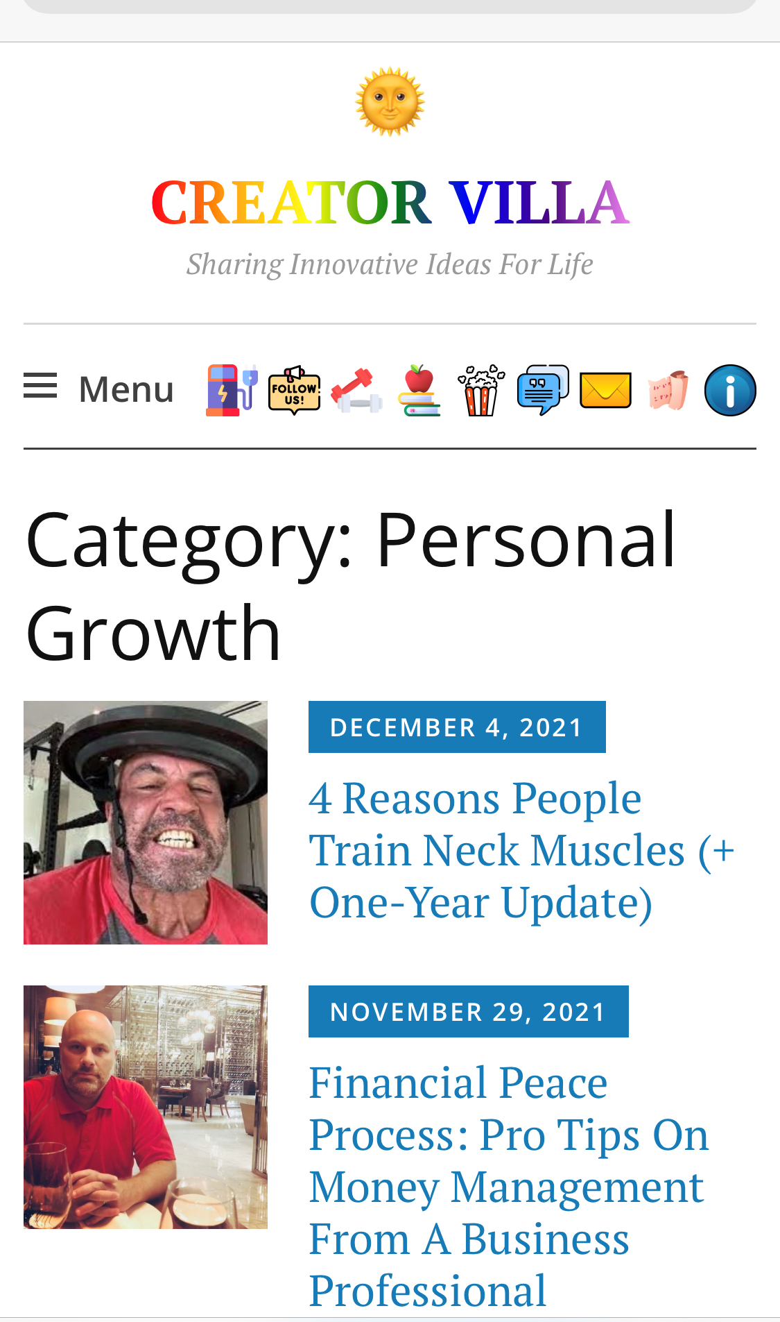
As you can see in Figure 1, the mobile category/homepage looks quite good. The layout is space-efficient, and users immediately get a snapshot of several posts, illustrated by the corresponding thumbnail of their featured images. When developers do not shrink the size of featured images for mobile, each post takes up almost the entire screen. That means users have to work harder to see several sample posts before deciding if anything on display is worth their time. On some themes, you can shrink the size of featured images on mobile and make some adjustments to the text with no problems. However, it saves time when theme developers have already optimized it accordingly–and the outcome is generally better. To my mind, not adequately shrinking the featured image of posts on mobile is old-fashioned and sub-optimal, yet themes where the default layout is proportionally smaller are few and far between. .
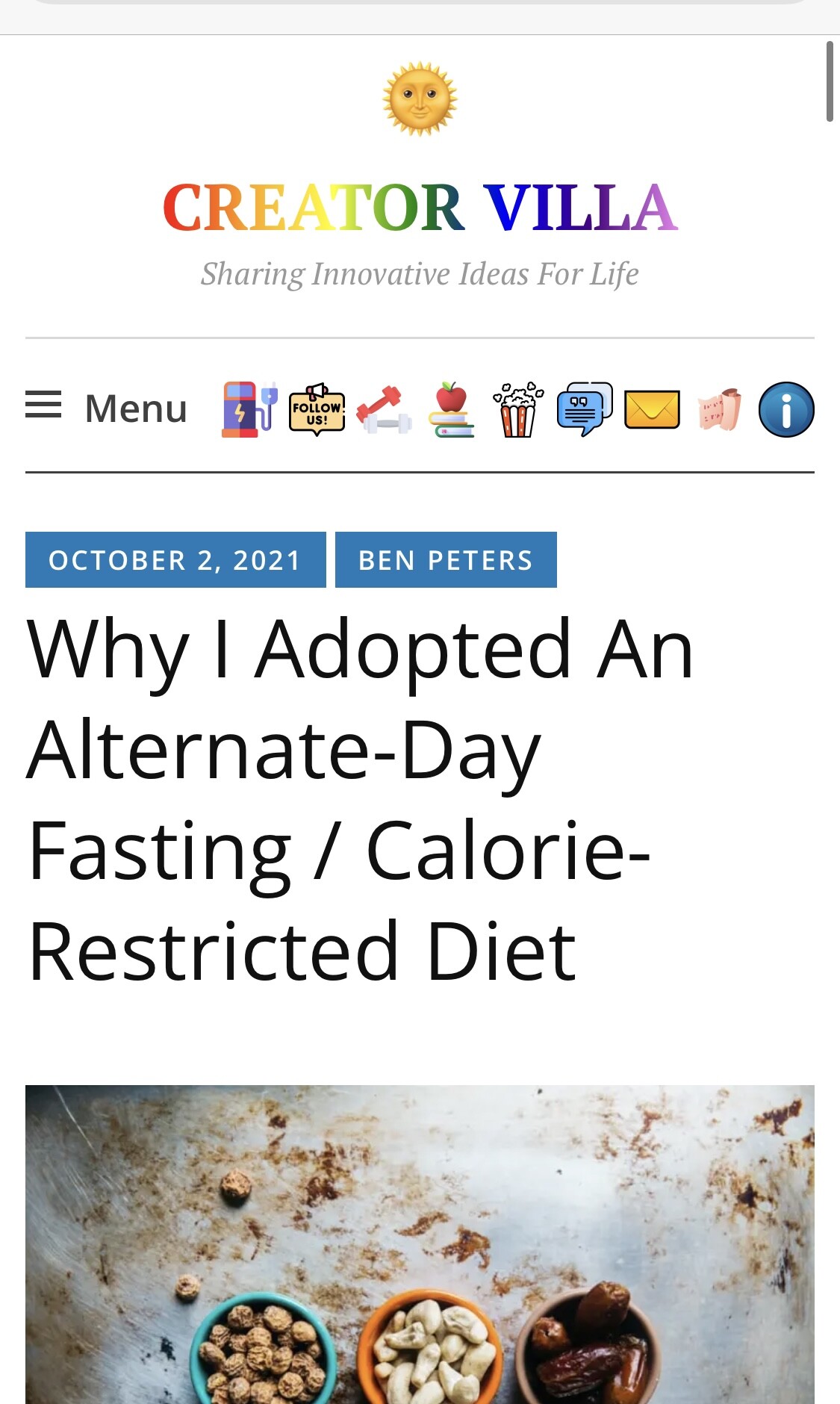
As you can see in Figure 2, the mobile post page is stylish and gets straight to the point. I have the setting to “display featured images at the top” disabled. The image you see in the screenshot is a custom photo that I added. (I begin every article with a custom photo that takes up 100% of the width in mobile. I will include custom CSS for that tweak down below. On this post, I made an exception and aligned the images to the right for easy reference.) I like it where the user sees the title of the post and a slice of the main image as soon as the page loads. It’s part of the “hook” that can persuade them to keep reading.
As you can see in Figures 1 and Figures 2, next to “Menu” I have a number of custom social icons. The social links menu is disabled for mobile by default, but you can enable it with some simple code. Once you’ve enabled the social links menu on mobile, it orders pretty neatly, as you can see in the screenshots. I created custom classes for each separate social link (easy to do when editing the social links menu in the admin panel) and filled the space for each social link with custom icons that point to specific URLs. (I will include the CSS down below to enable the social links menu on mobile. If you want add custom social icons, as well, let me know as that entails a few more steps.)
In addition to small thumbnails on the homepage/category pages, no-sense post pages, and social links navigation, Apostrophe 2 has a sidebar built in. The sidebar looks great on desktop, and is an opportunity to market featured posts, add quotes, stats, tags, e-mail/music widgets, etc. (see cover photo above). On the mobile, the “sidebar” collapses to the bottom, where it can similarly add a lot of useful information/functionality.
Apostrophe 2 supports site icon (image), site title (big text), and site description (smaller text below site title), as you can see in the screenshots. These blocks are highly customizable, and I like having all three built-in to a theme so that adding/customizing them isn’t a momentous task. (For example, I shrunk the site logo in mobile and increased the text of the site description on desktop using CSS).
No theme is going to perfectly suit anyone’s liking, and you will likely want to make some customizations. I have accumulated a lot of CSS code for this theme myself; however, almost all of these changes have been relatively minor. They say too much CSS can impact page load. If you have to do a lot of major changes to a theme, it may be a good idea to look for another one.
Apostrophe 2 CSS Customizations
The following code will display the social links menu on mobile devices with a width less than 767px (phones and tablets):
/* display social link on mobile / tablet */
@media (max-width: 767px) {
.jetpack-social-navigation {
display: block;
}
}
The following code will make images on mobile devices with a width less than 520px (primarily phones) take up the entire width–that way the text doesn’t wrap awkwardly.
/* full width post images on mobile*/
@media screen and (max-width: 520px) {
.wp-block-image {
width: 100%;
}
.size-large {
width: 100%;
}
.entry-content img {
width: 100%;
}
}
Comment below if you have any questions about CSS for this theme, and I’ll see if I can help. One of my Apostrophe 2 sites (that’s right, I have two) is hosted on WordPress.com premium, so I cannot install plugins. However, if you are self-hosted and have access to plugins, you can install something like the “Simple Banner” plugin, which looks quite good with this theme.
Note: One small stylistic issue I ran into. With the default homepage, when you hide certain categories, tags, etc., it still shows a blank “silhouette” for those posts. I couldn’t figure out how to disable it, even with the help of WordPress.com “happiness engineers.” Instead, I created a custom homepage using the “Blog Posts” block. With a little CSS and attention to detail, I got it to imitate the original quite nicely.
Good luck and happy blogging!